Skip to main content
Skip to footer
Skip to main content
Skip to footer


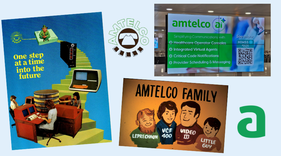
Over the last 50 years, the fundamental goal of marketing—connecting with people and telling a compelling story—has remained unchanged, but the design, medium, and execution have undergone a massive revolution.
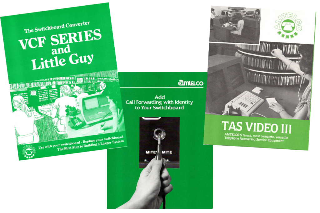
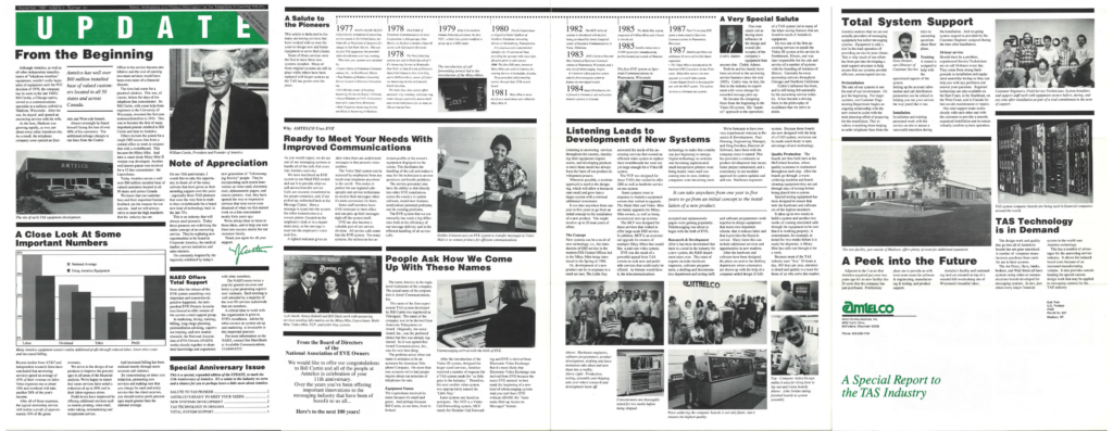
In the 1970s and 80s, marketing was an intensely tactile, deliberate art form. Amtelco’s campaign collateral relied on hand-drawn illustrations, carefully painted artwork, and meticulously set typography. Our marketers lived in a physical world where every touchpoint mattered. The weight and texture of a high-quality paper stock and the deliberate experience of a custom-folded brochure designed to reveal its message piece by piece. Reaching an audience meant relying on traditional direct mail or in-person conferences, where “open rates” were driven by the physical experience of unsealing an envelope or unfolding a letter.
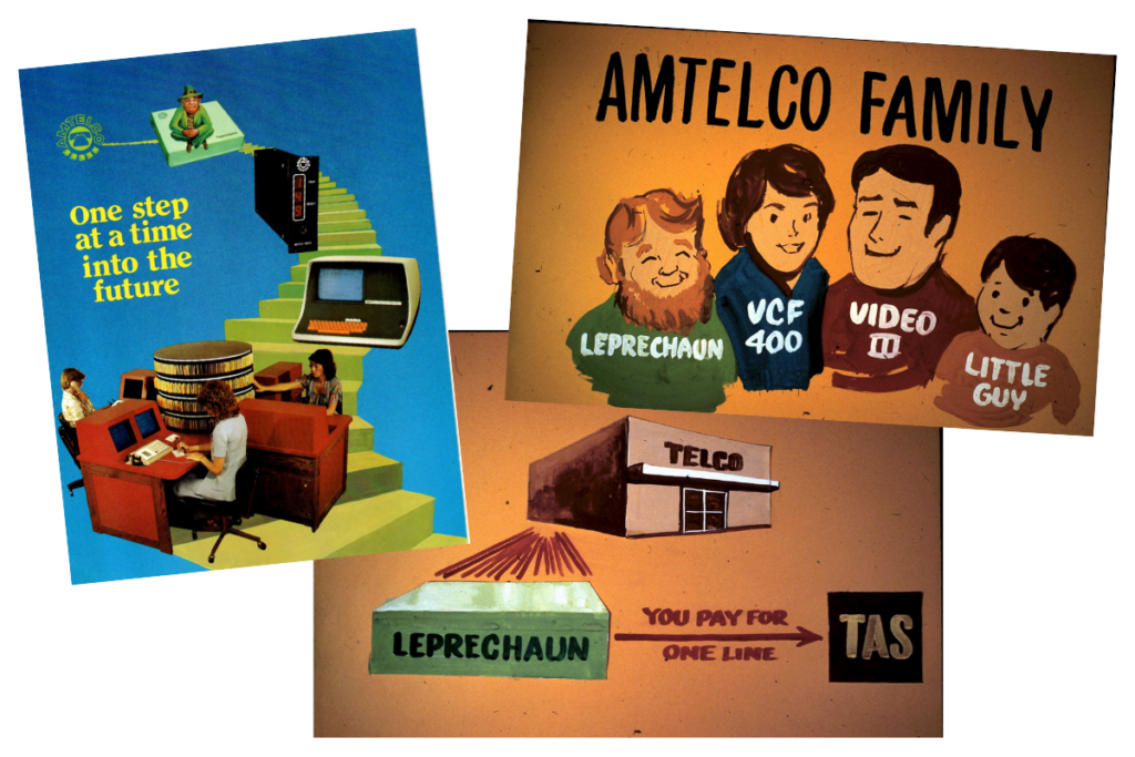
Color printing was a big deal and quite expensive! Much of what was printed at Amtelco was either 1-color (black ink for text and photos) or 2-color (black ink for text and photos, and Amtelco green ink for the logo). Using a 4-color process to mix cyan, magenta, yellow, and black to create full-color marketing pieces was rarely used or reserved for high-value marketing.
Today, those physical procedures have largely given way to a digital process. Amtelco has an entire marketing department dedicated to instantaneous, data-driven, and dynamic marketing to fit on flat screens of all sizes. Rather than committing weeks to printing and physically distributing static flyers, campaigns are designed digitally and launched globally with the click of a button.
Graphic design has shifted focus from ink retention and physical dimensions to pixel density, responsive layouts, screen contrast, and multimedia engagement. The text is written for both people and AI search engines to consume and understand its contents. Amtelco’s marketing efforts are delivered in rapid bursts across diverse digital channels, shifting our marketing from a one-way physical delivery to an interactive, ongoing digital dialogue.
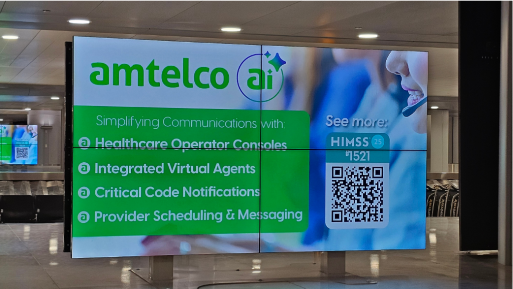
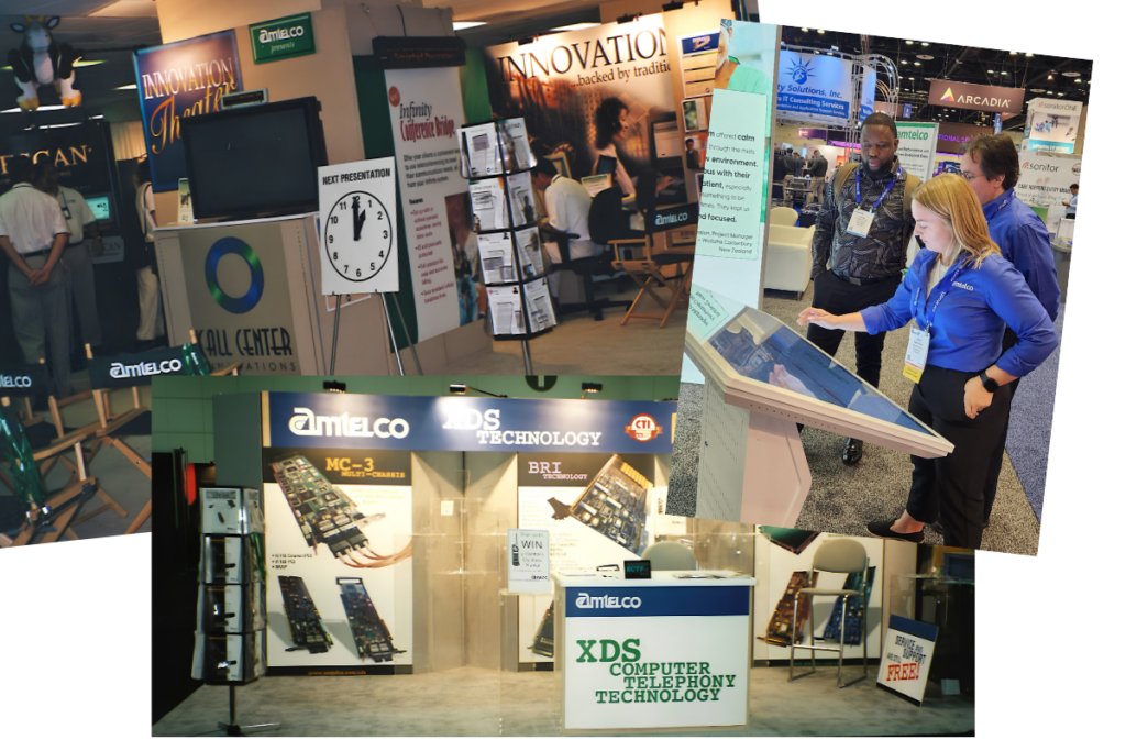
Even in high-touch environments like trade shows, where exhibit halls were once defined by printed signage, stacks of paper brochures, and business cards made from high-quality paper stock, today’s booths are powered by high-definition digital displays, dynamic video loops, and interactive touchscreens. Heavy physical collateral has been streamlined into sleek digital assets delivered on Amtelco-branded USB drives, QR code downloads, or direct follow-up emails. While physical touchpoints haven’t vanished entirely, they are now thoughtfully integrated into a digital-first strategy, serving as companions to an otherwise screen-based world.
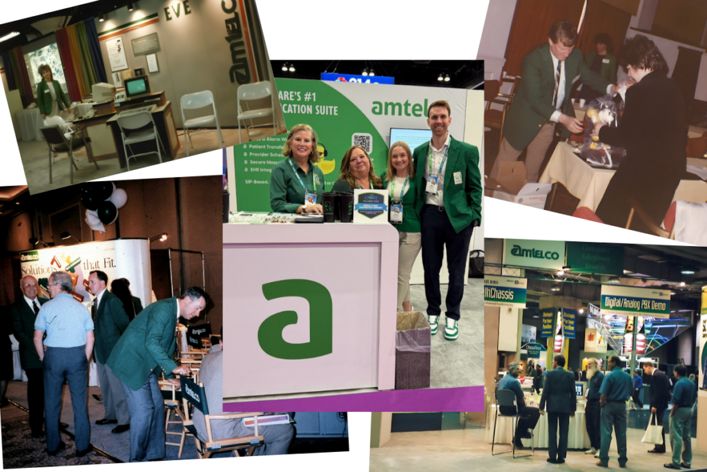
Speaking of trade shows, decades ago, our co-founder, Mr. Bill Curtin II, recognizing the importance of marketing and company identity, established the legendary green sport coat tradition. This marketing strategy required team members to wear custom-fitted coats from a haberdashery on State Street in Madison, Wisconsin, whenever representing the company. Mr. C’s grandson, Joe Curtin, brought back the tradition this year in honor of Amtelco’s 50th anniversary.
The Evolution of Amtelco’s Logo
A company’s logo is more than just a graphic on a letterhead. It’s a visual snapshot of its era, its technology, and its core mission. Over the years, our logo has represented the story of the company’s journey. Amtelco’s visual identity has thoughtfully evolved across three major eras. In our earliest days, the branding proudly featured a classic telephone handset, anchoring our identity directly to traditional telecommunications. As technology advanced and our offerings grew, we transitioned to the classic, bold Amtelco wordmark that served as our signature look for years. Today, our sleek, modern emblem pays homage to that legacy while looking ahead, featuring a subtle headset cleverly integrated into the design.
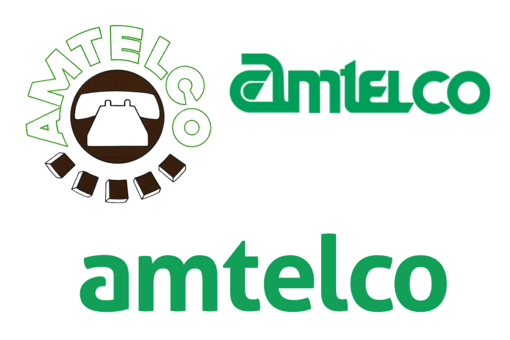
Rooted in Telecommunications: In our earliest days, Amtelco’s logo put our primary mission front and center. In an era dominated by manual switchboards and traditional telephone lines, that handset instantly told prospects and customers exactly who we were and what we did. We connected people. It was bold, literal, and connected us directly in the world of telecommunications.
Growth and Recognition: As our product offerings expanded beyond simple hardware connections to sophisticated call-handling systems, our visual identity needed to evolve, too. We transitioned to the classic Amtelco logo. Clean, confident, and recognizable, this typography-focused wordmark served as our visual identity for decades. It represented a mature, trusted partner in communications, carrying us through years of major technological leaps and the expansion of user communities.
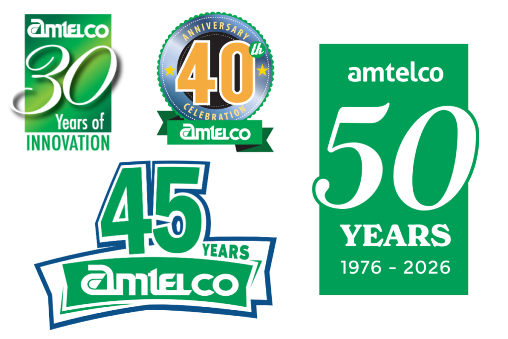
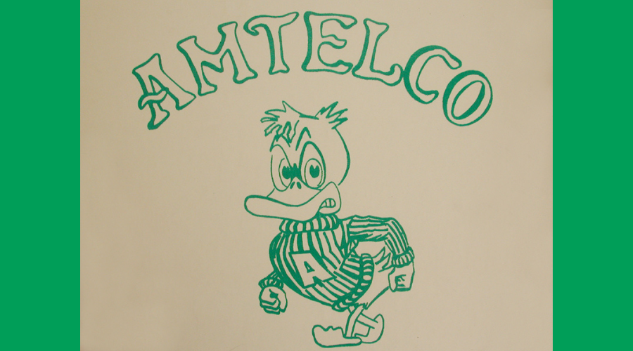
Honoring Legacy with a Brand Refresh: In anticipation of Amtelco’s 50th anniversary, the company underwent a brand refresh in 2024. Today, our branding reflects a unified, forward-looking, digital-first company. Designed to be clean and versatile across digital screens and modern media, our current logo appears sleek and streamlined at first glance. But look closely at the lettering, and you’ll find a subtle nod to our heritage: an integrated headset silhouette woven into the design of Amtelco’s “a” (which can also be found on Amtelco’s Duck mascot). It’s a quiet tribute to the communication professionals who have trusted our systems every day for half a century.